
Design mode
Use Design mode to select elements in the preview, queue visual changes, preview themes, and send the changes to Copilot as one request.
Design mode lets you point at the running app and describe visual changes. Fabricator previews the changes on the page, queues them as numbered items, and sends one structured request to Copilot.
Start Design mode
- Open the Build view.
- Wait for your app to appear in the preview. On the local preview, marked Local, Design works only between turns, with Deploy manually set to Manual deploy.
- In the preview toolbar, select Design.
- Click an element in the app.
Design works in the direct app view and in the Fabric portal shell view. When the app is embedded in the Fabric shell, Fabricator relays Design commands into the app frame.
Change one element
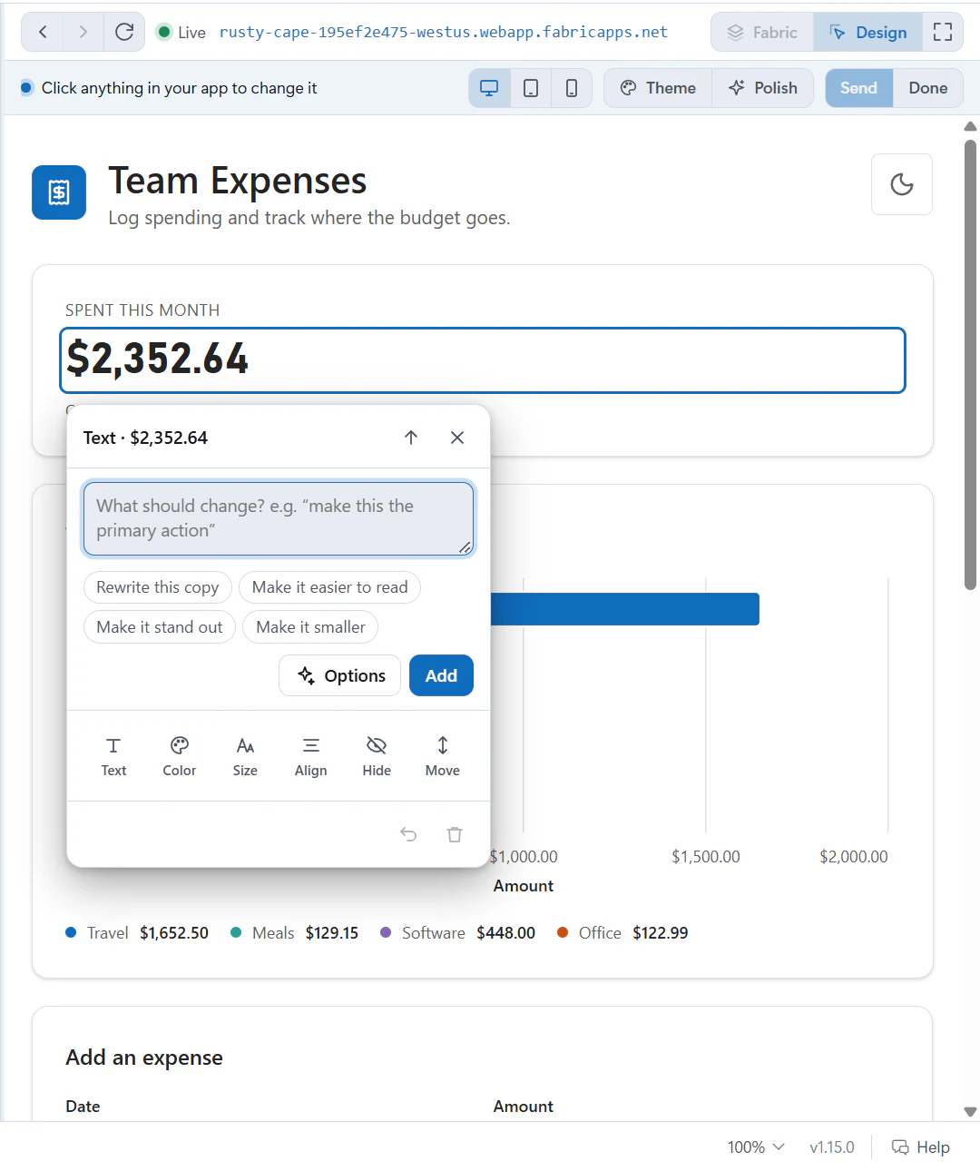
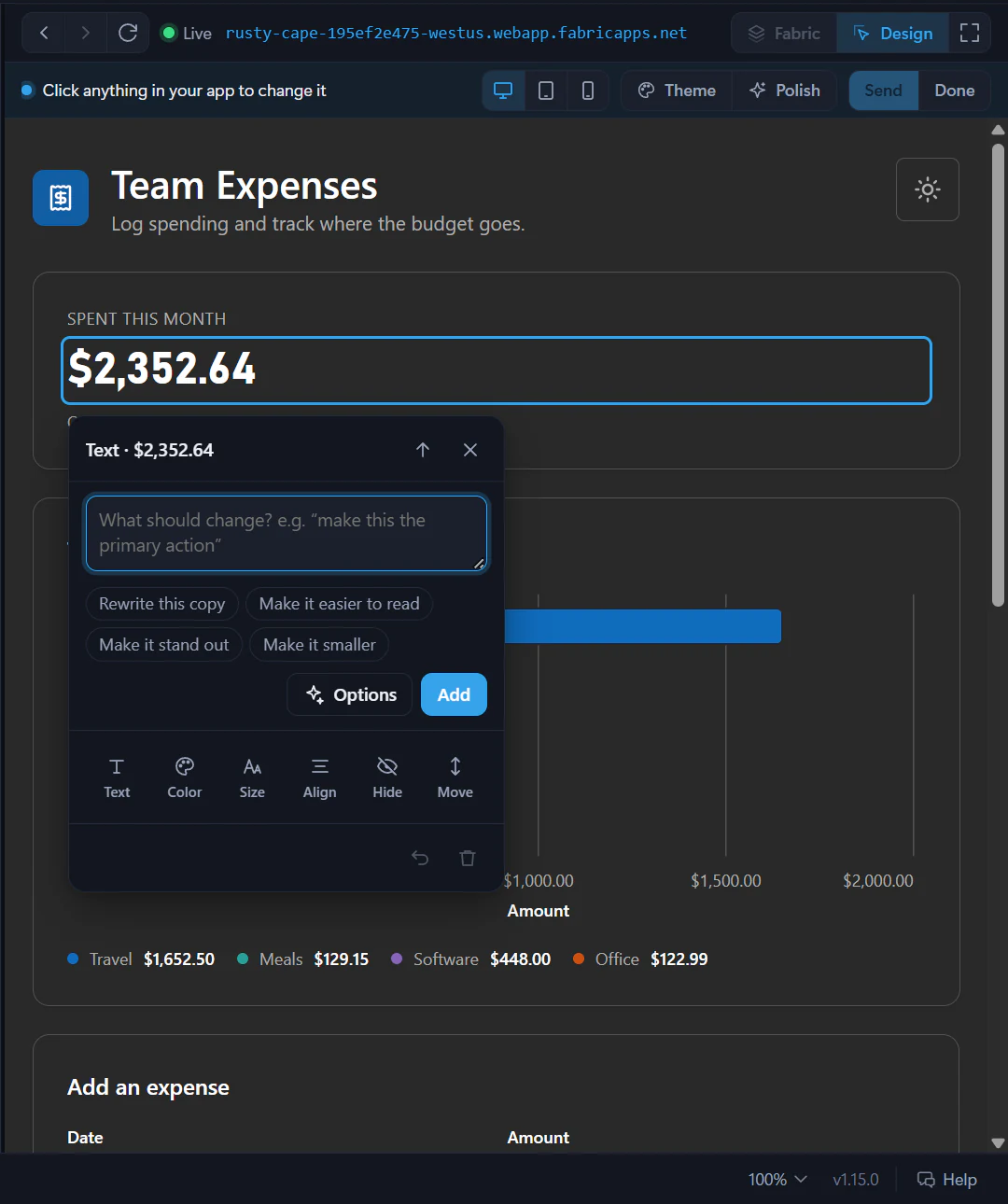
When you click an element, a change card opens beside it. The card is labelled with the kind of element, such as Button, Heading, Card or Chart.
Use the text box to type what should change, then select Add. The suggestions under the box are shortcuts such as Make it the primary action, Make it bigger or Switch to a bar chart, depending on what you selected.
Make this card feel more important than the others, but keep it consistent with the rest of the page.The card records each selected element as one numbered change. Use Update to change the instruction, Undo to step back through that change, or Remove this change to drop it.
Use quick tweaks
The tool row shows only the tweaks that make sense for the selected element:
- Text edits visible text in the preview.
- Color changes Text color or Background. When your app defines its own colors, such as
primaryorcard, they come first under Your colors, followed by palettes detected from the app and other Tailwind color choices. - Size steps text size and weight. It uses your app's own size scale when it has one, such as
text-300, and otherwise Tailwind-style values such astext-lgandfont-semibold. - Spacing changes padding and, for flex or grid containers, gap. It steps along your app's own spacing tokens when it has them, such as
p-400. - Corners chooses rounded-corner values such as
rounded-md,rounded-xlorrounded-full, or the nearest of your app's own radius tokens when it defines a custom scale. - Shadow chooses values such as
shadow-sm,shadow-mdorshadow-xl. - Align changes text alignment or distributes items in flex layouts.
- Hide queues Remove it for the selected element. Show it again removes that hide tweak.
- Move offers Earlier and Later for moving the element among its siblings.
Most choices preview on hover and apply on click. Fabricator records the intended Tailwind vocabulary and CSS preview, so Copilot can make the source change instead of copying temporary inline styles.
Change charts
For Graphein charts, the card shows a Chart section. You can change:
- Type, including bar, line, area, scatter, pie, KPI, table and other supported visual types.
- Palette.
- Legend.
- Sort, when the chart type supports it.
- Vertical or Horizontal orientation for bar charts.
- Values formatting for charts with a
yencoding. - Title.
Chart changes keep the live data in the preview. The request sent to Copilot includes the chart spec changes but omits the data.
Ask for Options
Select Options to ask a fast Copilot model for a few alternate looks for the selected element. Fabricator picks a quick, low-cost model from your Copilot plan, such as Claude Haiku or GPT Luna, and asks it to think briefly. When the model can read images, Fabricator also sends it a picture of the element.
The options follow your app's own design: its colors, text sizes, spacing and corners when it defines them, without gradients or glows unless you ask for them.
While it runs, the card names the model it's asking. Each option appears as soon as it's ready, under Options — hover to preview, click to apply, and Designing more… shows while the rest arrive. Select Stop to keep the options you already have.
Hover an option to preview it. Click one to keep it. Use More options to ask again or Done to close the options list.
If the options request fails, use Try again or describe the change yourself in the text box.
Apply a change to similar elements
When Fabricator finds matching elements, the card shows an Also 2 more like this-style checkbox. Turn it on to apply the same queued change to the selected element and the similar elements Fabricator found.
This is useful for repeated cards, table rows or buttons. Copilot still receives the selected element's details and the scope note, so it can decide whether to change a shared component or repeated call sites.
Adjust the theme
Select Theme in the Design bar to open the theme panel.
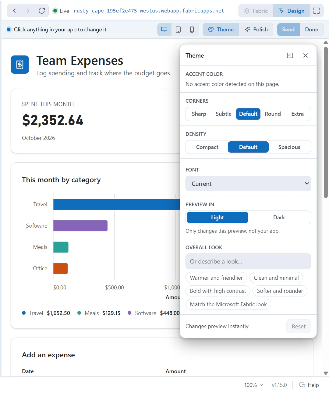
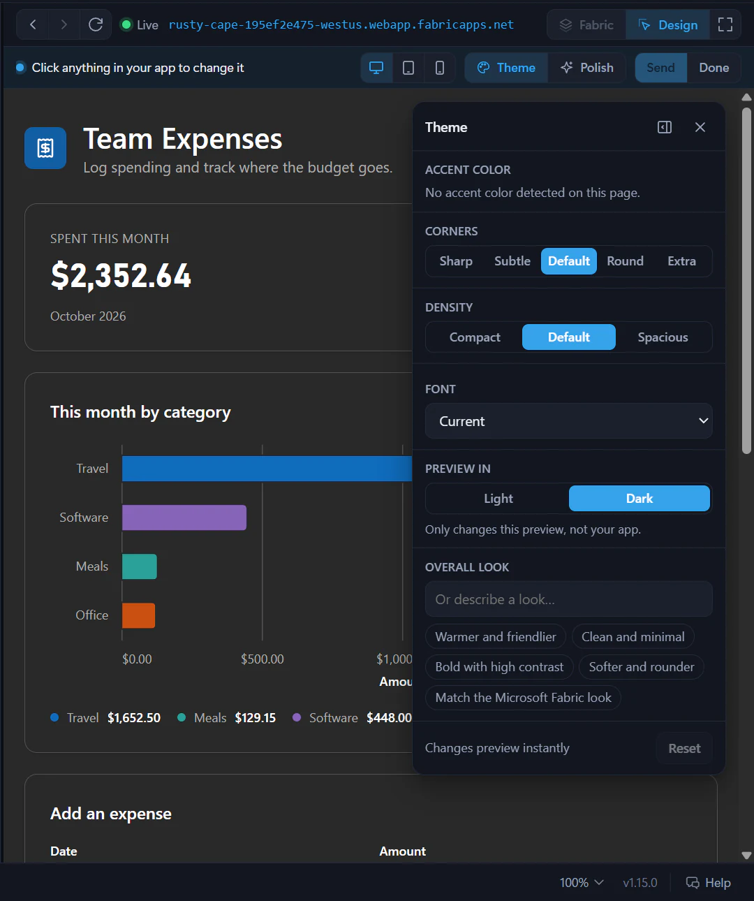
Depending on what Fabricator detects in the app, the panel can preview:
- Accent color. In apps that theme through a color token such as
primary, the accent changes that token, with a lighter shade in dark mode. - Neutrals.
- Corners.
- Density.
- Font.
- Preview in Light or Dark, when the app has dark-mode styles.
- Overall look, including preset chips such as Warmer and friendlier and Match the Microsoft Fabric look.
Theme changes are queued as one Theme change. Reset removes that queued theme change.
Run a polish review
Select Polish in the Design bar to run a quick design review of the current page. Fabricator collects a page outline and a screenshot, then asks the same fast model for suggestions that fit your app's design.
The Polish suggestions panel can show Preview, Add and an Add all 3-style button. Preview applies a temporary visual preview. Add queues the suggestion as a design change.
Change preview width
While Design mode is on, use the preview-width buttons:
- Desktop fills the pane.
- Tablet previews at 820 CSS pixels.
- Phone previews at 390 CSS pixels.
Use these widths to check responsive layouts before sending the changes.
Send changes to Copilot
Queued Design changes appear as chips in the chat composer under a 1 design change · sent with your message-style status. Click a chip to show it in the preview, remove one with its Remove this change button, or select Clear to drop the queue.
When you are ready, select Send in the composer or the Send 1-style button in the Design bar. Fabricator sends:
- Your note, if you typed one.
- A full screenshot of the previewed result, when capture succeeds.
- Crops of up to six changed elements.
- The selected element labels, text, classes, selectors and route.
- Chart spec changes, without chart data.
- Likely source locations from the project files.
Your message appears in chat as a Design card. Expand Details sent to Copilot to see the full structured prompt.
If the design turn fails, use Retry on the failed chat message. If it completes but you want a fresh attempt, use Try again on the latest answer.
Live preview
Use the preview pane to watch local changes during Copilot turns, check the deployed app, switch Fabric shell views, and handle busy preview ports.
Code and history
Browse project files, open the folder in VS Code, inspect diffs, and restore earlier git snapshots from Fabricator's Code view.